

examples of bad design in everyday life
We have just defined that good design is relative and that some well-known designers have specific principles to help them have a better understanding of what that could mean. Based on my own set of principles, I have selected 6 examples of good and bad design. Do you know more? I'd be interested to hear about it.
- Tape Dispenser — Good Design
You are probably thinking: "really?" Well, really.
I have recently gone through 2 office movings and I can assure that it would have been MUCH more painful without it.
If you have used a tape — which I imagine you have — you can relate to the sensation of being well into doing something and suddenly losing the end of the tape (and never finding it again). For the simple reason of making life easier, I have given the tape dispenser a primary spot on this list, although, it is also quite easy to understand, durable, effortless and I would dare to say, timeless — for as long as we need to close boxes with tapes.
2. Vichy Catalan Can — Bad Design
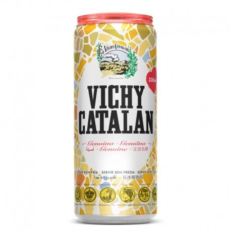
Vichy Catalan is a very famous mineral water in Barcelona and it has a particular salty taste that makes it very refreshing. Even though the product is quite delicious, they have made a packaging decision that REALLY bothers me — they have decided to include a plastic cap on the top of the can that allows you to "store" some mineral water for later.
This redesign sounds very out of its time when we are debating the excessive use of plastic everywhere. Also, saving mineral water for later — just like saving an open can of Coke for later — doesn't work. This idea is not only useless, but it also creates more plastic waste without any real need.
3. Hydrating Creams in Big Plastic Bottles — Bad Design

I understand that some companies nowadays are not necessarily concerned with producing products that are durable, but the fact that you pay for a whole bottle of hydrating cream and can only access half of it because the packaging is badly thought of drives me crazy.
The cream I used as an example is not the only one that we have to cut open, in order to get the product that remains on the bottom of the container.
This product is designed to shorten the purchasing cycle, as you will think you have already finished your cream when in reality there is still much more left.
It is certainly not sustainable nor honest.
4. Menstrual Pants — Good Design
We can no longer ignore the impact of our actions on the environment and that we will face dramatic changes in the next years. For a very long time, something as natural as women's menstruation was never thought of something that could impact our planet, until someone has decided to sum up the number of menstrual products a regular woman uses in her lifetime. Can you guess?
Between 5 and 15 thousand pad/tampoons per woman, that's 5.8 billion pads per year, only in the U.S.
Therefore, my next choice seems quite obvious: reusable menstrual underwear. It's a highly innovative, simple to use, inclusive, sustainable and timeless product. It comes in different shapes for different menstruation flows and it needs no explanation. Brilliant!
5. Laundry Detergent Cap — Good Design
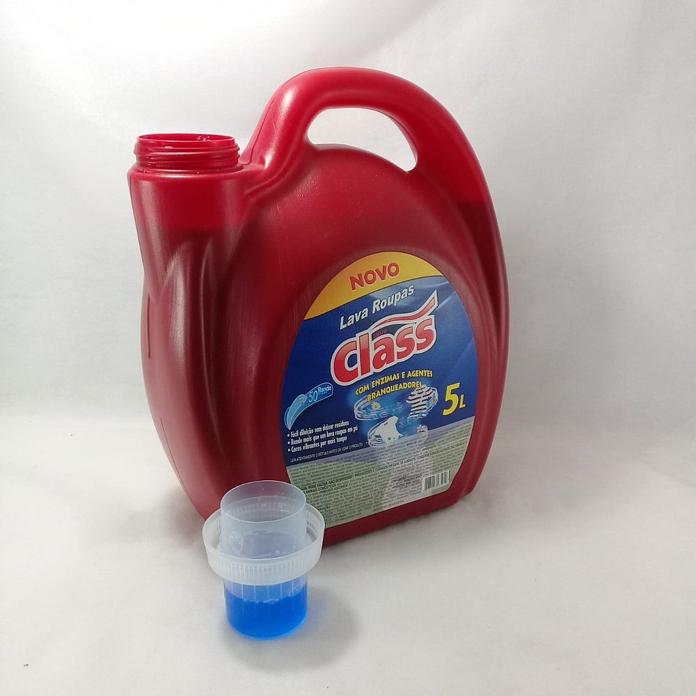
I remember the times where this amazing invention still didn't exist and I also remember thinking: "This is so stupid".
If you don't do your laundry, you are certainly missing the pleasure of pouring the soap into the detergent lid and then placing the lid back into its place without making a mess.
This is a simple redesign that has change something simple, but now you can see it in every detergent container, everywhere in the world. A great example of usefulness, effortless and innovative redesign without having to reinvent the wheel.
6. Supermarket Cashier— Bad Design
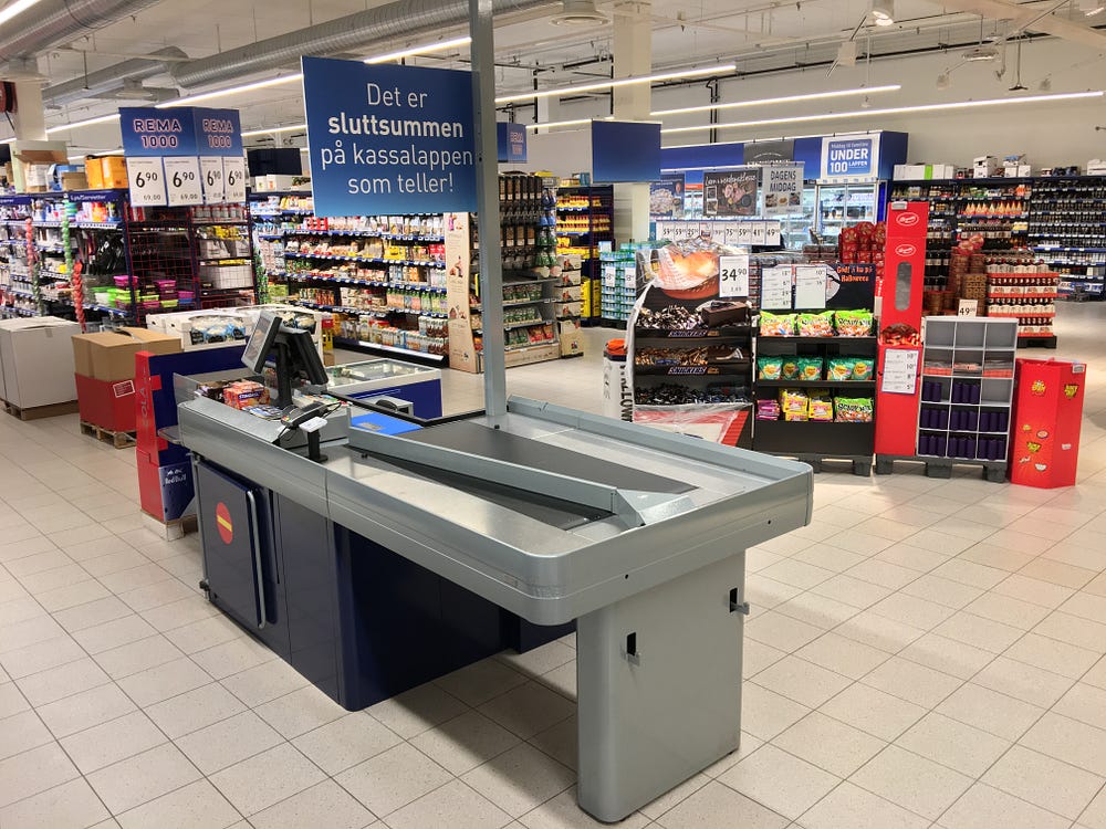
Every time I go to a supermarket and the moment to take my groceries to the cashier arrives, I have a mini panic attack. Independent of how much you have bought, it seems that you enter a speed competition to pack everything as fast as possible and leave without complaints.
Some supermarkets have already added the cashier on the picture where there is a separation in the middle in case you would are taking your time to pack, but as soon as the next spot is full by the next client, I start to worry.
I would love that someone would come up with a solution to pay for groceries in a different way so that the checkout process stops being so stressful.
examples of bad design in everyday life
Source: https://medium.com/@anandamele/design-in-daily-life-good-and-bad-design-examples-c498cb40d4fb
Posted by: bennettandonellove.blogspot.com
0 Response to "examples of bad design in everyday life"
Post a Comment